Design System
Goals
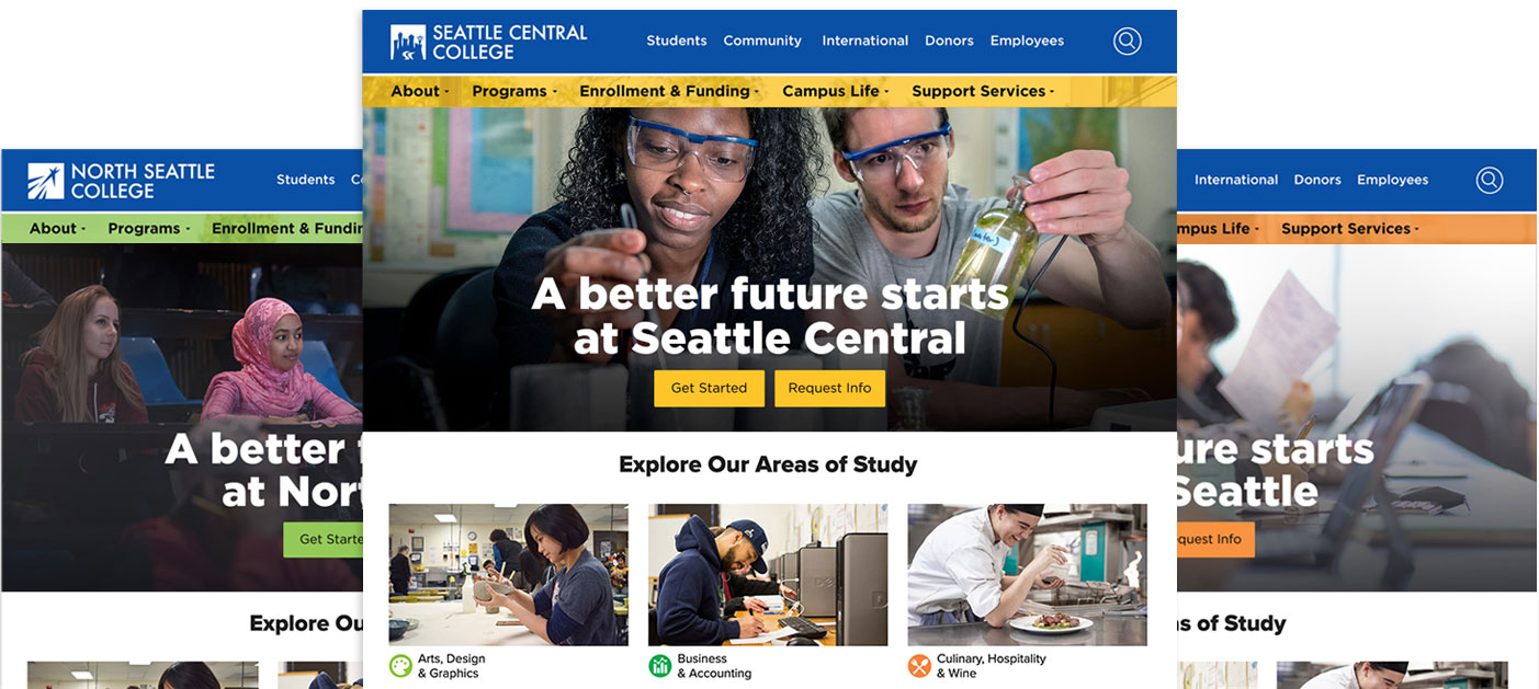
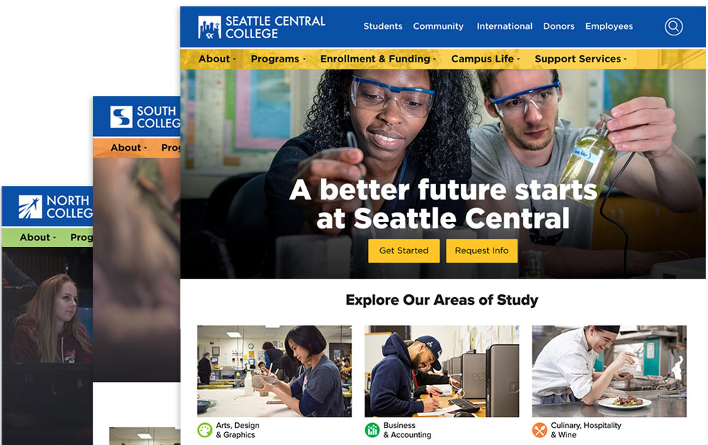
Seattle Colleges’ design system’s goal is to build and renew the user experience at Seattle Central , North Seattle , and South Seattle from the ground up. It will help teams achieve higher efficiency, consistency, and scalability when building digital products.
Role: Design lead, branding, user experience, components library

I formed a small design team with four graphic designers. Our first task was to pick one blue color to represent the brand. I verified the final blue (#0c489b) had a high contrast ratio (8.69 AAA) for accessibility.

Together we had decades of institutional knowledge. We chose historical secondary colors for each college. I created tints and shades.
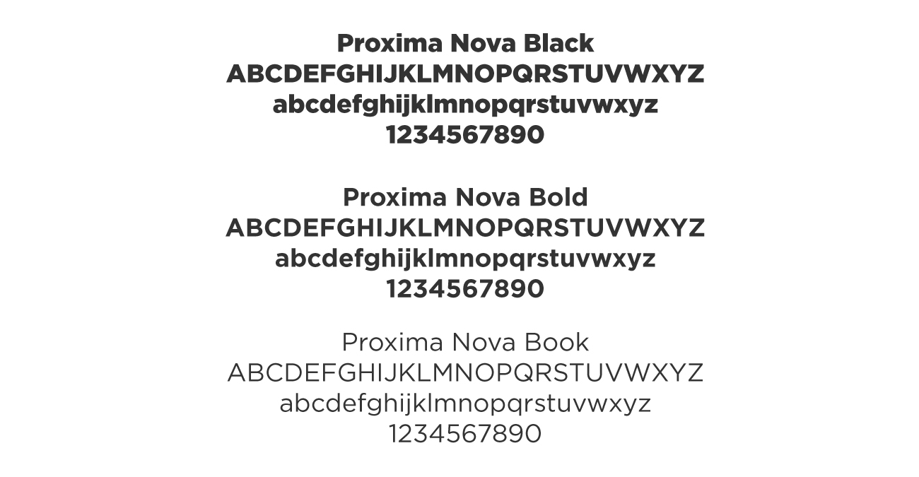
I chose the web font. It is a hybrid that combines modern proportions with a geometric appearance. A fellow UX Design Lead who works for a large toy company said, Can’t go wrong with Proxima Nova.
Our design group showed three header concepts. We each designed many rounds of ideas, went back and forth, and whittled down to these together. The final design was the clearest in terms of accessibility, branding, and usability.
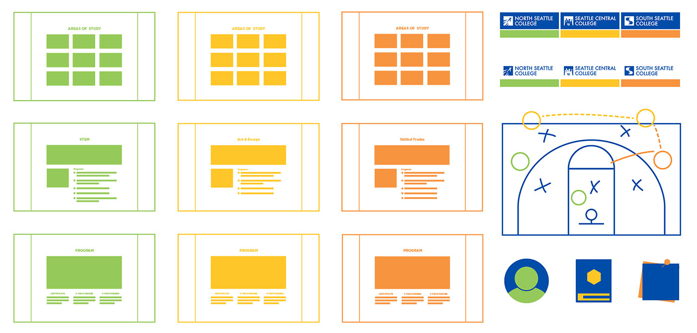
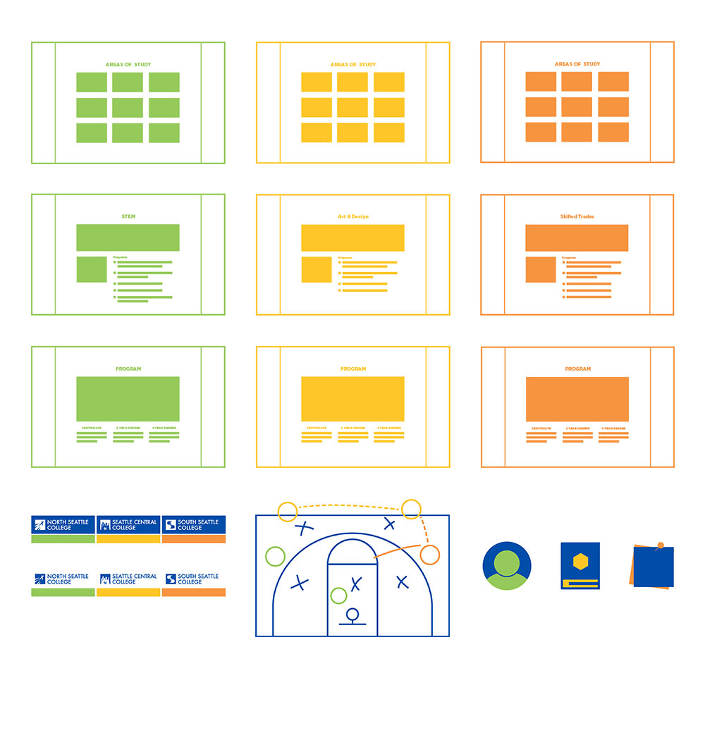
As interests and skills surfaced, team members natural roles emerged. I created user flows, content patterns, and page templates. I tested for adequate white space and text color contrast for accessibility.
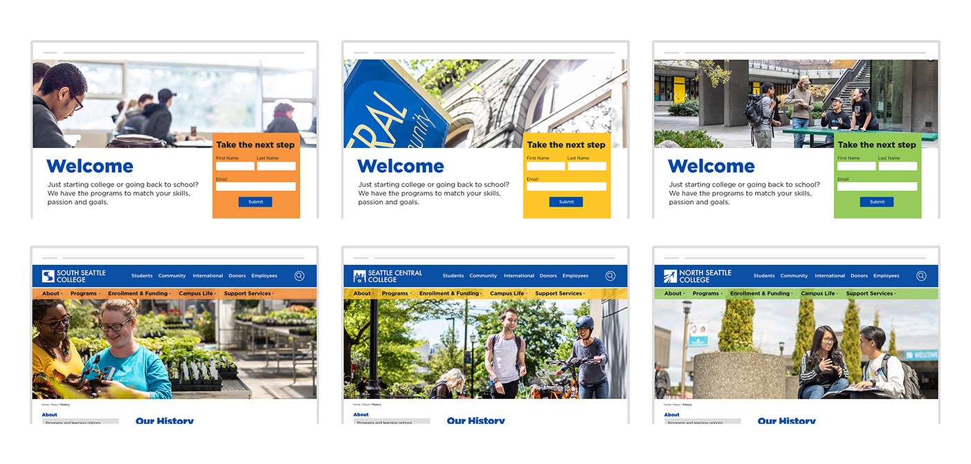
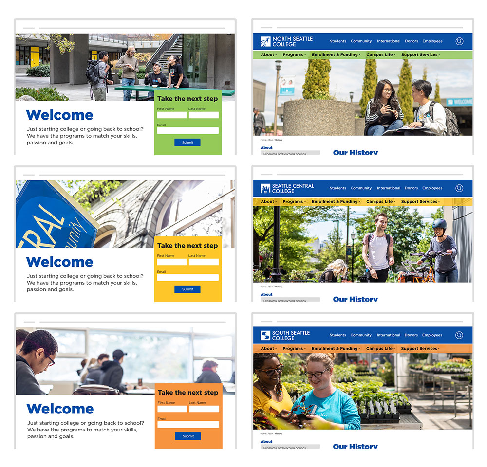
I rapidly prototyped recruiting and basic page designs. I tested how similar content layouts would look for each college.
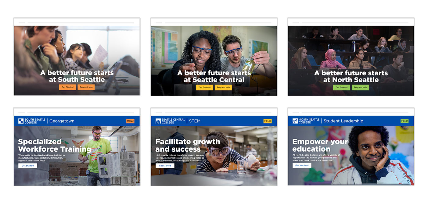
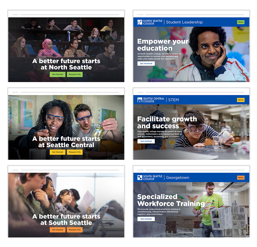
I designed and built front page banners w/ CTAs, and microsites. I tested how content patterns behaved when the window size changed for responsive design and readability.

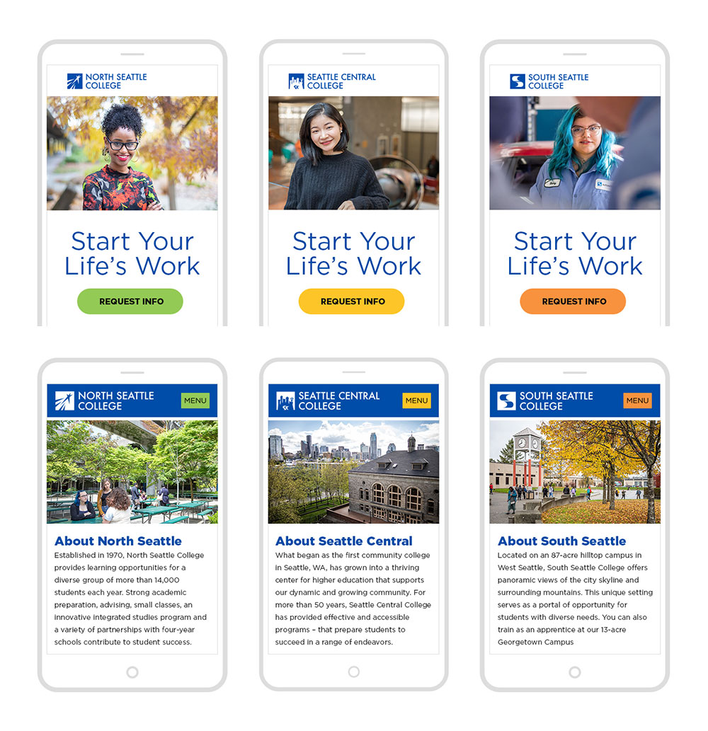
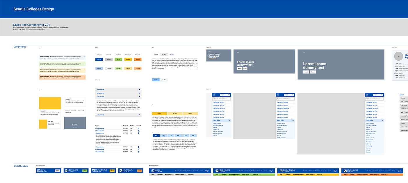
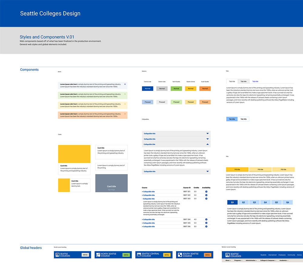
The web development team created Drupal themes and templates from my prototypes. When the team built a new feature, I added a reusable component to the library.
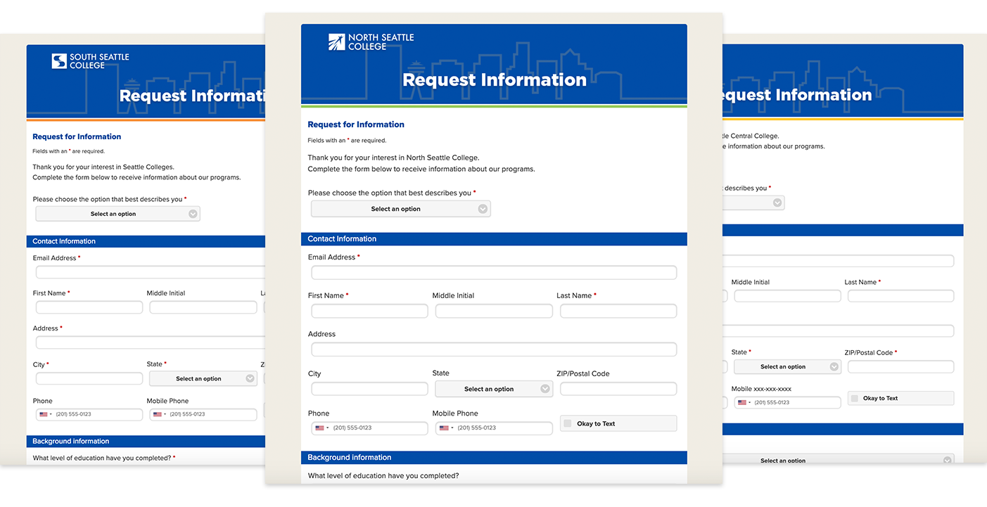
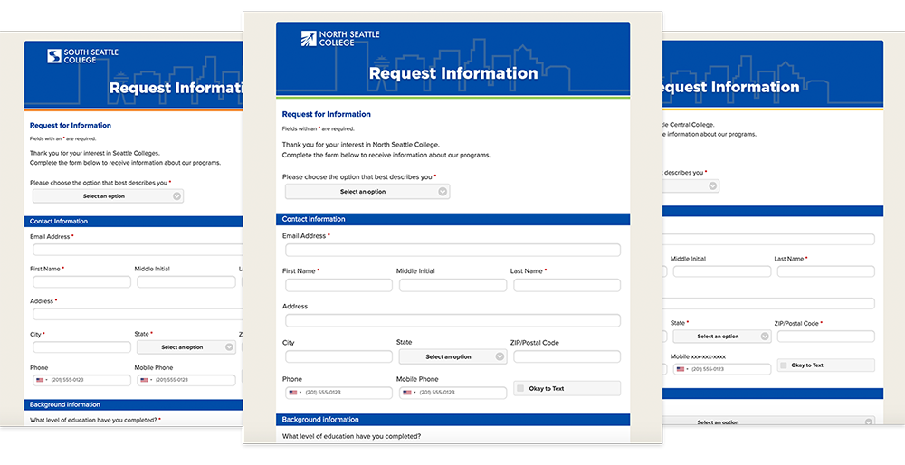
I overhauled elements from third-party systems like email templates and forms.
I assisted communications and marketing teammates in building out the information architecture . Based on a student usability survey, I sketched flexible templates for the user journey, wrote meaningful navigation item names, and implemented a menu hierarchy.
Outcomes
My role was to guide the team through the process of creating a design system and partner with them to execute their vision. I designed reusable components, authored our Figma library, built prototypes, and wrote the CSS and HTML.


